3D and WebGL websites that still load in under two seconds
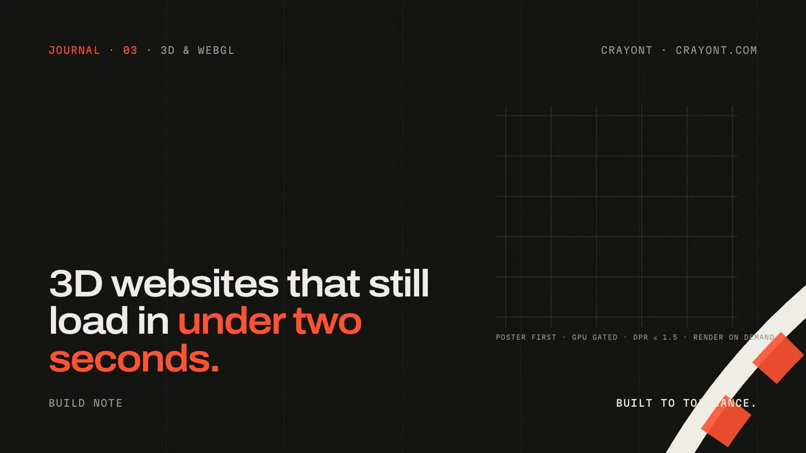
How a design-engineering studio builds 3D and WebGL websites that stay fast on a mid-range phone: poster first, GPU gating, on-demand rendering, capped pixel ratio and a reduced-motion state that is designed, not forgotten.
TL;DR · Key takeaways
- Never load the 3D library before the page is usable. Ship a static poster first, then load WebGL after the page is ready, the browser is idle and the scene is in view.
- Gate on capability: skip WebGL entirely on data-saver, slow connections, low-memory devices and reduced-motion. The poster is the experience there, and it must look finished.
- Render on demand, not on a timer. Draw a frame when something changes (scroll, pointer, resize) and cap the pixel ratio at 1.5. The GPU sleeps the rest of the time.
- Measure on a mid-range Android phone on mobile data. If it isn't under two seconds there, it isn't fast.
Most 3D websites are slow, and everyone knows it. The demo looks stunning on the designer’s MacBook, then loads in nine seconds on a phone in Bangalore traffic and the visitor leaves before the first frame. The 3D itself isn’t the problem; the way it’s loaded is.
These are the rules we follow on every 3D and WebGL project, including the homepage of this site, where the machined “C” in the hero is a live WebGL scene.
1. Poster first, always
The page must be complete without WebGL. That means a static poster (an SVG or an image) sits exactly where the scene will appear, in the same size, with the same composition. It is the Largest Contentful Paint element, it loads in the first hundred kilobytes, and it stays if anything fails.
The scene then fades in over the poster. A visitor on a fast laptop sees a live 3D object a second later; a visitor on a weak phone sees a finished illustration and never knows the difference. Nothing jumps, so layout shift stays at zero.
2. Load late, and only when it matters
Three.js is not part of the page’s first load. We import it dynamically, after four conditions are true:
- The page is ready (the preloader is done and the main content is on screen).
- The browser is idle (via
requestIdleCallback, with a short timeout). - The scene’s container is in or near the viewport.
- The device can afford it (next rule).
That ordering keeps the library download off the critical path. The headline, the copy and the call to action are usable long before a single triangle is drawn.
3. Gate on capability, not on hope
Before loading anything, check whether it’s worth it:
- Data saver on? Skip WebGL.
- Connection effectively 2G? Skip.
- Fewer than four CPU cores, or less than 4 GB memory reported? Skip.
- The visitor prefers reduced motion? Skip, and make sure the poster is a considered, static design, not a broken state.
Skipping is not failure. The poster is the experience for those visitors, and it has to look intentional.
4. Render on demand
A naive scene renders 60 frames a second forever, which drains a phone battery and keeps the fan on a laptop spinning. Ours renders when something changes: a scroll position, a pointer move, a resize. When nothing changes, the loop stops and the GPU sleeps. Even a gentle idle animation is kept tiny and paused the moment the scene leaves the viewport or the tab is hidden.
Two more caps that matter on phones: pixel ratio limited to 1.5 (a 3× retina render of a full-width canvas is enormous for no visible gain), and geometry built in code wherever possible. Our machined C is a few hundred triangles with no textures; the edges, hidden lines and the section cut are drawn in shaders, not loaded as images.
5. Dispose properly
Single-page transitions and back-forward cache can leave WebGL contexts alive after the page is gone. We dispose the geometry, materials and renderer on pagehide, and re-mount if the page is restored from cache. Browsers limit the number of live WebGL contexts, and a leaked one is a blank canvas on the next page.
6. Design the reduced-motion state
“Reduced motion” is not “turn the site off”. Around one in ten desktop users and many mobile users have it enabled. On this site, reduced motion means: no preloader animation, no pinned scrolling, the poster instead of the scene, and every reveal shown at rest. It’s a designed layout, checked in screenshots like any other state.
7. Measure on the phone that matters
The final test is not a Lighthouse run on a MacBook. It’s a mid-range Android phone on mobile data, with the scene loading after the page: LCP under two seconds, no layout shift, and the 3D fading in without stutter. If that test fails, the scene gets simpler until it passes. Speed is the constraint the design has to fit, not the other way around.
What this looks like in practice
Open this site’s homepage on a phone. The headline and copy appear immediately, the drawing of the part is a static SVG, and the live scene fades over it only if your device can afford it. On a laptop, scroll and the part turns through its four passes; leave it alone and it drifts slightly so it never looks frozen. Either way the page measures the same at the top, because the 3D was never allowed to be the thing you wait for.
If you’re planning a launch site, a product configurator or a scroll-driven 3D story and you’ve been told it can’t be fast, send us the brief. It can, with these rules.
FAQ · Questions people ask
- Does a 3D website hurt SEO?
- Only if the 3D replaces content. Keep the headline, text and links in real HTML, put the 3D scene in a canvas that loads after the page, and give it a static image fallback. Search engines and AI assistants read the HTML; the canvas is decoration to them.
- How heavy is Three.js?
- The core library is a few hundred kilobytes compressed before your scene, which is why it should be loaded lazily and only on devices that can afford it. Geometry built in code costs almost nothing; textures and models are where the weight comes from.
- Can a 3D site work on phones?
- Yes, with limits: fewer polygons, no heavy textures, pixel ratio capped, and the scene paused when it scrolls out of view or the tab is hidden. On phones that can't afford it, the site should show the poster and still look designed.